
Last updated on May 14th, 2021
How to create your unique corporate identity
It’s incredibly important to consider how your company is seen by current and potential customers and to develop a strong corporate identity that encapsulates your brand’s values and intent, and represents its core offering. But WHAT is a corporate identity? WHY is it so important? And HOW do you create a strong corporate identity that sets your business up for sustainable success?
Lets get started
1. What is a Corporate Identity?

2. Getting your Corporate Identity Started

3. Developing a Corporate Identity

4. Expanding your Corporate Identity

1. What is a Corporate Identity?

A corporate identity is the physical look and feel of your brand, in other words, it is the visual DNA of your company.
1.1 What is the purpose of a Corporate Identity?
- It creates a consistent and clear visual identity for your company
- It conveys that your company is a professional and reliable organisation
- It establishes your brand equity and standardises your company’s visual representation
Maintaining a consistent corporate identity is vital if you want to present your business in a professional light. Sticking to a particular palette of colours and fonts, consistent logo positioning, as well as using the same tone of voice throughout your printed and online communications will all help to enhance your professional stance.
Recognise this brand?
1.2 What is the difference between brand and Corporate Identity?
While branding can be defined as relating to the emotional relationship between the customer and a business, the corporate identity is all about the look and feel of the business. The latter helps a customer to distinguish their favourite brand from a plethora of other, similar businesses. A well-known brand name evokes a sense of trust and reliability, whereas its corporate identity speaks of the product/company’s individual quality, it’s ethos and it’s focus. However, when the product/company establishes its identity, it is recognized as a brand.
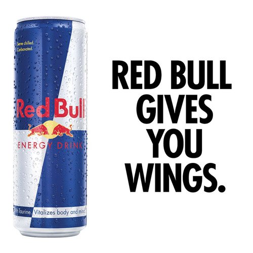
An extremely well established brand; Red Bull

Corporate Identity
It is through the process of branding that you build a corporate identity, which is a collection of tangible expressions of your company, such as your logo, colours, typography, and tone. The more distinct, specific, and cohesive these elements are, the higher the likelihood that they will shape a differentiated brand that is recognisable and admired.
Brand
A brand is a set of distinctive perceptions, ideas, and feelings that people have about your company, which set it apart from others. Basically, your brand is what your consumers think of you. As Scott Cook, co-founder of Intuit, puts it: “A brand is no longer what we tell the consumer it is—it is what consumers tell each other it is.”
2. Getting Started

2.1 Why is a Corporate Identity necessary for your business?
Many businesses, big and small, neglect to spend the necessary time developing their basic identity when starting out, this leads to a shortfall in their brand at a later stage when consumers or clients cannot recognise the business as one brand.
In short, your brand is the way your customer perceives you and, therefore, it is the most important reason why you need a good and solid CI from the get-go.
Your brand identity is what sets your business apart from an endless sea of competitors and shows your customers who you are and what they can expect from working with you. If you want your brand to be perceived in a positive light, it’s crucial that you nail your brand identity and create designs that accurately portray who you are to your customers. Now that you know what a CI is and why it’s important for your business, it’s time to start designing.
2.2 Where to start?
First things first—before you start building your corporate design, you need to define who you/or your clients are, and what they do.
You should know everything you can about your client/or your own business before getting started with the corporate identity. See 30 questions to ask when designing a logo.
2.3 Understand what makes the business unique
It all starts with your reason for going to work every day and why anyone else should care. As Simon Sinek famously stated, “people don’t buy what you do, they buy why you do it,” therefore you need to understand the business’s core values and mission.
Companies like Patagonia, TOMS or Lush who have a powerful and, more importantly, genuine mission are able to get not just customers but also employees fully engaged and committed to what they do.
Simon Sinek

-Lush values displayed on website
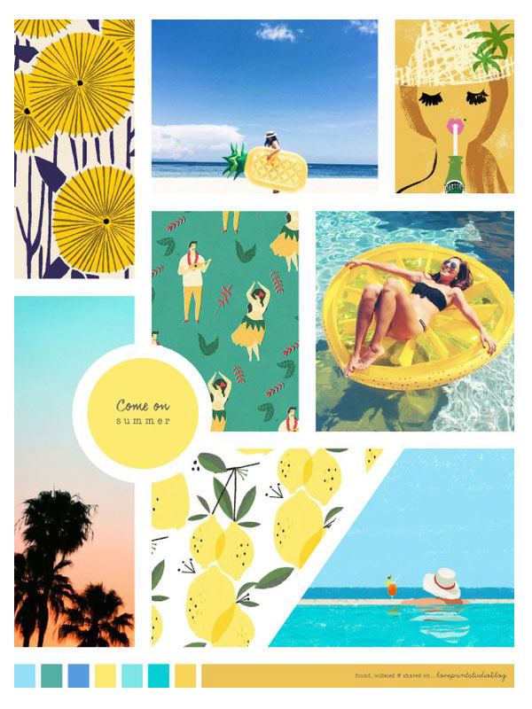
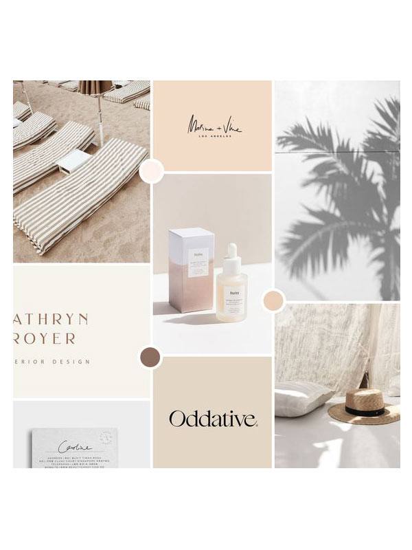
2.4 Once you know who your company/client is, you can start to visualise the brand.
A mood board is the next best way to convey your vision of a company to the client with the use of reference images, fonts, colours etc. Once you have the basic look and feel down, then you are ready for your CI to be created! See the example of two mood boards below and notice how you can already start to see the brands come to life.
3. Developing a Corporate Identity

A Corporate Identity consists of a variety of design elements. These make up the look and feel of the brand.
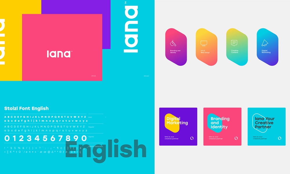
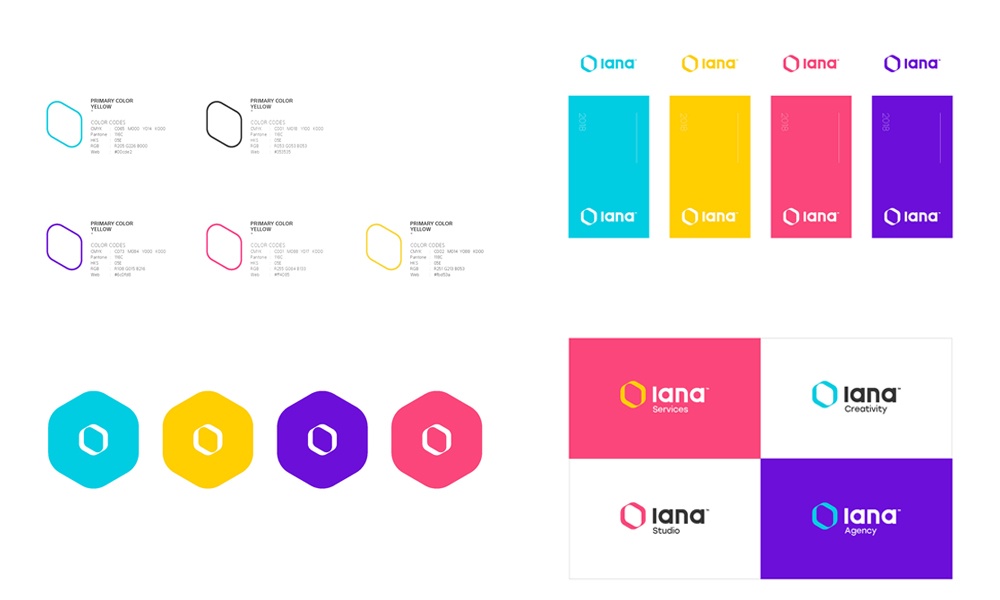
The 6 elements that make up a Corporate Identity
LOGO
A good logo is a visual mark that reflects both what you do and who you are. There’s no one way to design one, but research has shown that different shapes can influence how people perceive your brand. This is important to consider, depending on the message you’re trying to communicate.
No matter your design, it should be clear and simple enough to identify at lower resolution or in smaller sizes, such as a favicon or profile pic on social media.
The 4 main logo types:
LETTERMARKS
Lettermarks are typography based logos’ using the initials of a company name. The type choice is crucial for this type of logo as it is the main design element in the logo and therefore the first element to convey the company’s brand. This type of logo is often used when a company has a very lengthy name and prefer to use an abbreviation instead.
WORDMARKS
Wordmarks are also typography based logos but using the entire business name as the logo. This type of logo is great for new brands that need their full name seen, as brand recognition has not been established yet. This looks like a simple type of logo but, because of that, it becomes harder to make it unique and stand out against the crowd.
LOGOMARKS
Logomarks are based on a simple and iconic graphic. This type of logo is only recommended for established brands that have a distinct look and feel and can be recognised by just a shape or even colour. Through color and form, you can attribute meaning and cultivate emotion around your brand within a logomark.
COMBINATION
This self-explanatory name says it all. This type of logo is often preferred by a company as it is a set unit, i.e the typography and graphic are combined as one, and therefore is easier to make more distinguishable from other brands.
TYPOGRAPHY
Typography may seem simple, just choose a font that looks nice, right?, Well it’s a lot more than just that. Your type needs to communicate your brand persona effectively as well as work cohesively with your logo.
Limit the number of font families to 2-3. This generally includes a primary typeface, then secondary typeface(s) for specific purposes based on where it will be used, such as a body copy typeface, UI typeface, etc.
The different typography styles:
SERIF FONTS
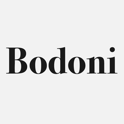
Serif fonts have an anchor on the end of each letter. This type is a more traditional and detailed font, so it’s a good choice if you’re going for a more classic feel for your brand design. Bodoni is a timeless example of a serif font.
SANS SERIF FONTS
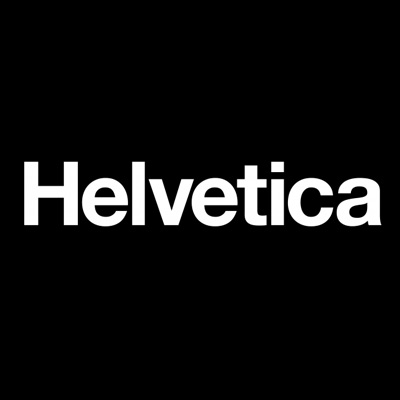
Sans serif fonts don’t have the little feet that serif fonts have. This type is categorized by rigid edges and lends a sleeker, more modern feel to designs. A popular Sans serif font is Helvetica.
SCRIPT TYPOGRAPHY
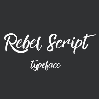
A type of display font is Script typography which emulates cursive handwriting and is a great choice for making your brand design feel more luxurious, feminine, or sophisticated. Allura is a classic example of a script font.
DISPLAY FONTS
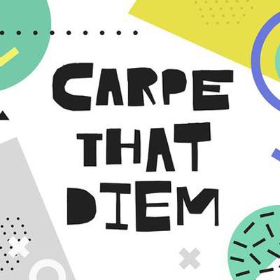
Display fonts have their own specialised element that defines them, whether it’s a specific shape or a hand-drawn feel. These fonts should be used carefully to avoid a cliche, overwhelming look but can be used in moderation for emphasis.
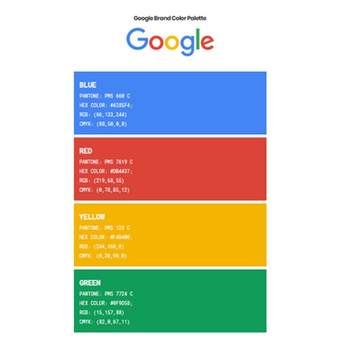
COLOUR PALETTE
Brands with great colour schemes didn’t come across them by accident. Richard Branson demonstrated this direct approach when he chose the Virgin logo’s vibrant shade of red, encouraging his customers to be bold and confident, mirroring his own distinct business methods. Coca-Cola shares this approach, using red to appear energetic, vibrant, and memorable.
Having a clear idea about what your brand’s goals are and how you want your target audience to feel about your brand will help you hone in on the most impressive colours to choose for your brand. A good colour palette is clean and flexible, supplying designers enough choices to be creative but not too many to overwhelm.

Colour palette types:
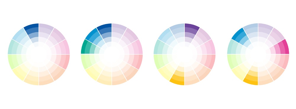
- Monochromatic — When you have one personality trait that you want to focus in on, a monochromatic colour scheme will emphasise the meaning of that one brand colour. While great for minimalist brands, the challenge here is differentiating the hues enough so that your sight doesn’t become visually stunted
- Analogous — Colours next to each other on the colour wheel have harmonious relations since adjacent colours usually have similar emotional connotations. Analogous schemes are safe bets but as such, they are not the best for standing out or drawing attention.
- Complementary — Color complements — or opposites — are colours directly across from one another on the colour wheel. Because they’re opposites, they bring out the best in each other when paired; you see complementary colours a lot in sports teams. Complementary colours are great for dynamic, stimulating visuals, but be careful of copycatting another brand since they’re so popular.
- Triadic — A stable branding colour scheme, triadic colours draw in equal parts of three different sections of the colour wheel. Triadic schemes are stable, like analogous themes, but offer a more stimulating variety, like complementary schemes. The hardest part is getting the three colours to coincide with the traits of your brand identity.
ICONOGRAPHY
What exactly is an icon? An icon is a graphic representation of something bigger and more complex- it should summarise a topic or an idea into a simple, recognisable graphic.
Use icons where appropriate to keep messaging simple, visual, and engaging. Icons hold a big responsibility in your CI as they are the first visual element, after the logo of a brand, that conveys the tone and feel of your business. Icons extend the brand’s look and feel i.e is the brand playful? clinical? etc. Icons are often overlooked when creating a CI but hold a lot of potential for brand recognition.

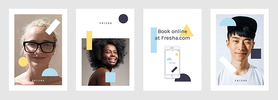
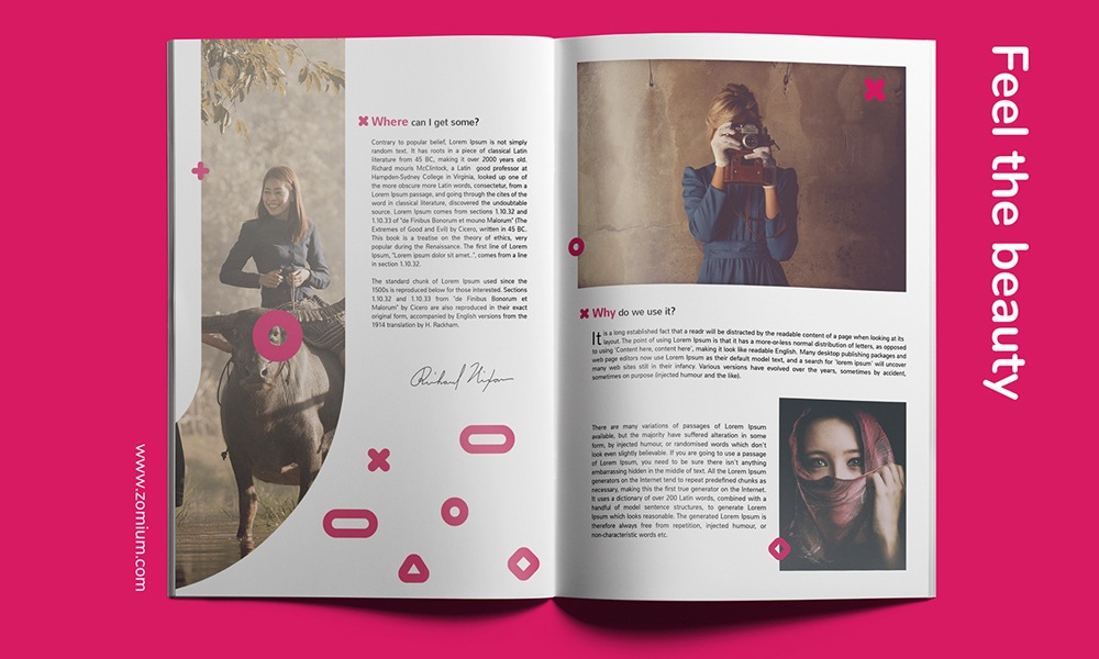
IMAGERY
Imagery can be in the form of photography, illustration or even film. The imagery needs to portray your brand as well as attract it’s target market. For example; creating an identity for a kids clothing brand, the imagery will need to be colourful and happy so that it attracts parents and children alike.
The style of the illustrations and photography need to be consistent throughout so that your brand remains recognisable. Check out an image manipulation service here.
LAYOUT
Grids, Overlays, White space, Shapes- There are many ways to display content.
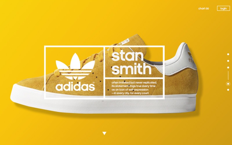
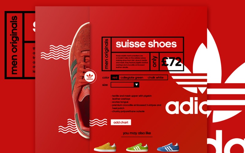
The layout is very important when creating a visual display such as a webpage, a brochure, or any other advertising methods. When considering the layout guide, you need to consider all the CI elements you have created and think of what the best way to display them would be. Let’s take a look at this Adidas layout; They have used thick, bold lines to display copy, a variety of image sizes to display the product in a playful way, and bright solid background colours with illustrated overlapping lines. This layout illustrates the playfulness of the brand and uses all these elements cohesively in one environment.
4. Expanding Your Corporate Identity

Once you have a great looking and functional corporate identity (which includes a logo, all typography, a colour palette, and a CI manual), where do you go from there?
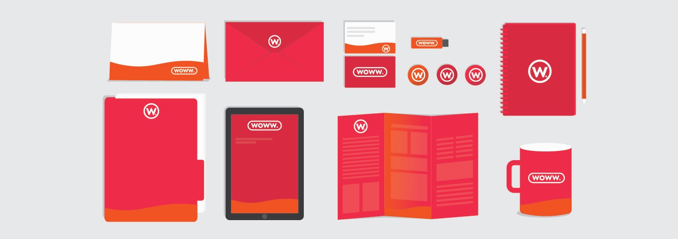
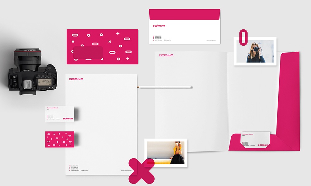
4.1 Brand collateral
Now it’s time to expand your brand through various marketing and advertising channels. Which include, but are not limited to:
- Business cards
- Letterheads
- Email template/signatures
- Posters/flyers
- Branding on apparel, vehicles etc.
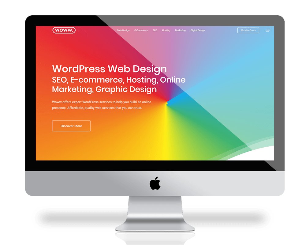
4.2 Designing your website
Now that you’ve designed your CI, it’s important to establish brand awareness by building a strong online presence.


Recent Comments